
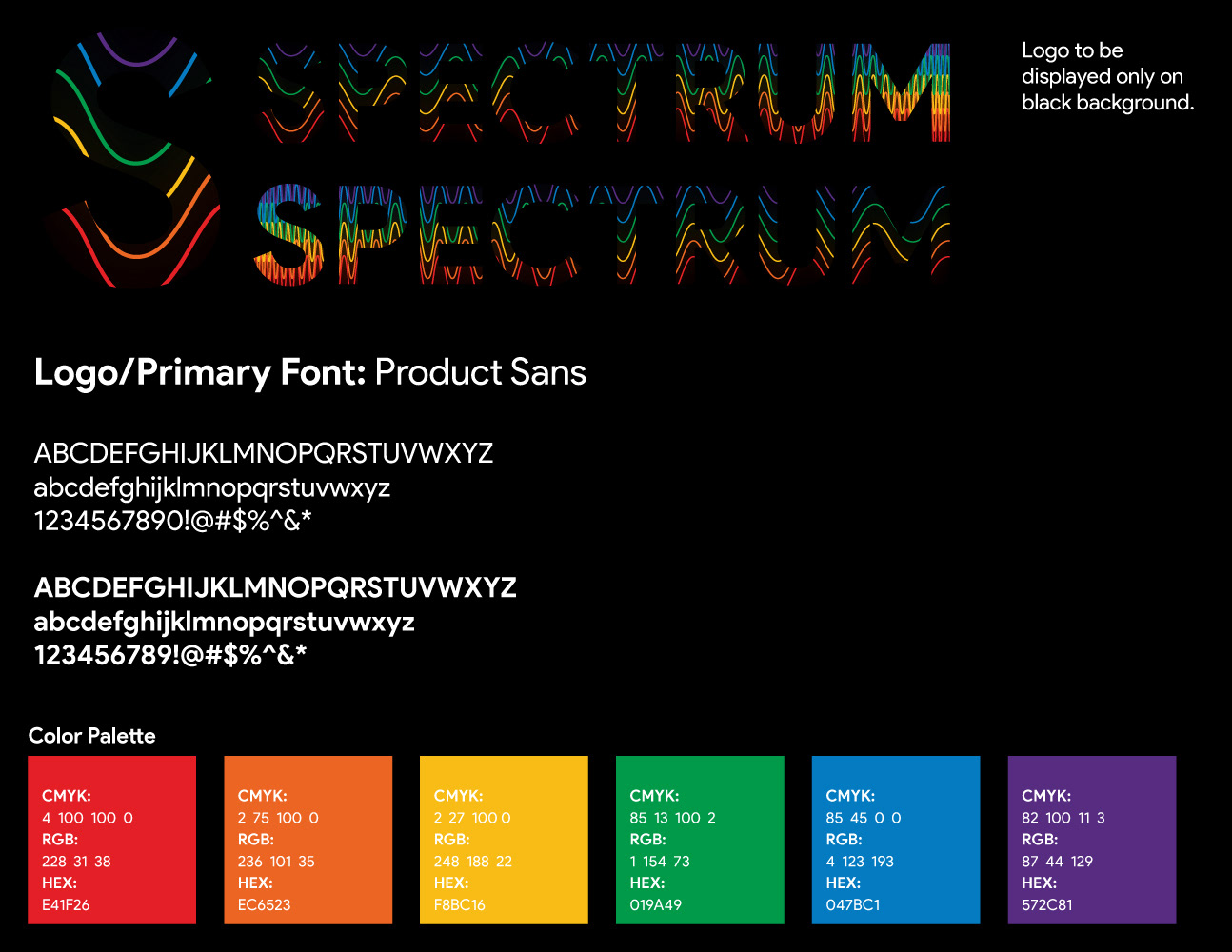


Every year the graduates of MCTC's graphic design program are in charge of all aspects of the show. In the early stages, we split into desired groups and began brainstorming on what we wanted the potential theme to be. Something about the word Spectrum seemed to fit for me. Most of us were all completely different in more ways than one in regards to inspiration, style, etc. I thought the word itself summed up what we were.
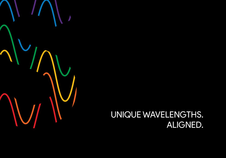
As a part of the print team I was tasked with inital mock ups of logos, postcards, posters. I was drawn to the concept of the visible spectrum and how the wavelength moved across the page. Being drawn to bold sans serif fonts, I felt the juxtapostion of the straight lined text with the chaotic wave created powerful imagery.
Unfortunetly we went in another direction for the show and Spectrum was abandoned.